.jpg)


It’s safe to say that, these days, more and more companies are buying into the value of user-centred design, and more specifically, user research (or discovery) led design.
Regardless of the techniques used and the robustness of any research carried out, an all-too-common problem that still remains is the way research findings are communicated and used.
Companies state, often with a sense of authority, that they’re swimming in customer data. Yet, does that data always tell the right story to engage the wider organisation in taking the resulting action?
Humanising research data is a critical part of any good Discovery process, for the following reasons…
Why it helps
It brings insight to life - to help business staff and stakeholders understand the context and value of the work done.
It promotes greater empathy - it’s easier to motivate people into improving service delivery when they’ve walked in the shoes of their customers.
It can be easily shared - in the right format, rich yet simple visualisations of user research can be socialised with minimal explanation to maximum effect.
It becomes a key foundation of your design toolbox - the right outputs can be repeatedly used to inform and facilitate design prototypes, content strategy and more detailed internal business design processes like service blueprinting.
It creates a framework that underpins solution development - grounded in a clear, shared and objective understanding of the problem to be solved.
Typical outputs
Let’s look at a few well-established, tried and tested outputs that bring research data to life, that make it easier to take action from insight:
Personas
OK, so these have been around for a long time. A common pitfall, however, seen time and again, is that Personas are too often based on the opinions (and by extension, the assumptions) of a group of internal stakeholders.
Like any design artefact, they’re only as good as the data that created them. It’s tempting for teams to shortcut to describing the relationship they have with their target audience segments, based on anecdotal or often purely analytics data, that doesn’t give context (or the ‘why’) behind their customers' real-world problems or intent.
When a good mix of qualitative and quantitative data is gathered and analysed correctly, we’re able to format our Personas around meaningful data points:
Demographic: Triangulate common themes that emerge from across the wider customer landscape, rather than the insights gathered from a few individuals.
Situation: Clearly describe the typical context each target customer segments lives in - this will promote empathy and help internal stakeholders see the whole picture.
Behaviours and attitudes: What tiggers, motivators and detractors will affect the way these groups make decisions. What will influence positive engagement in a potential product or service, based on known factors (rather than a wishful assumption that that’ll want to interact with a whole host of product features).
Goals: What do these groups want to achieve? How do they solve the healthcare issue they might have, and what does a good outcome look like for them?
Pain points: What are the blockers that might prevent these people from achieving their goals? These might be broader mental or psychological barriers, or physical, such as limited access to or ability to use digital services).
User needs: articulate a specific, evidenced set of user needs, that can be used as the foundations (or ‘Epics’) of your feature backlog. No features should be prioritised in the resulting design production process if they can’t be linked back to a known user need.
A word on visualising your Persona
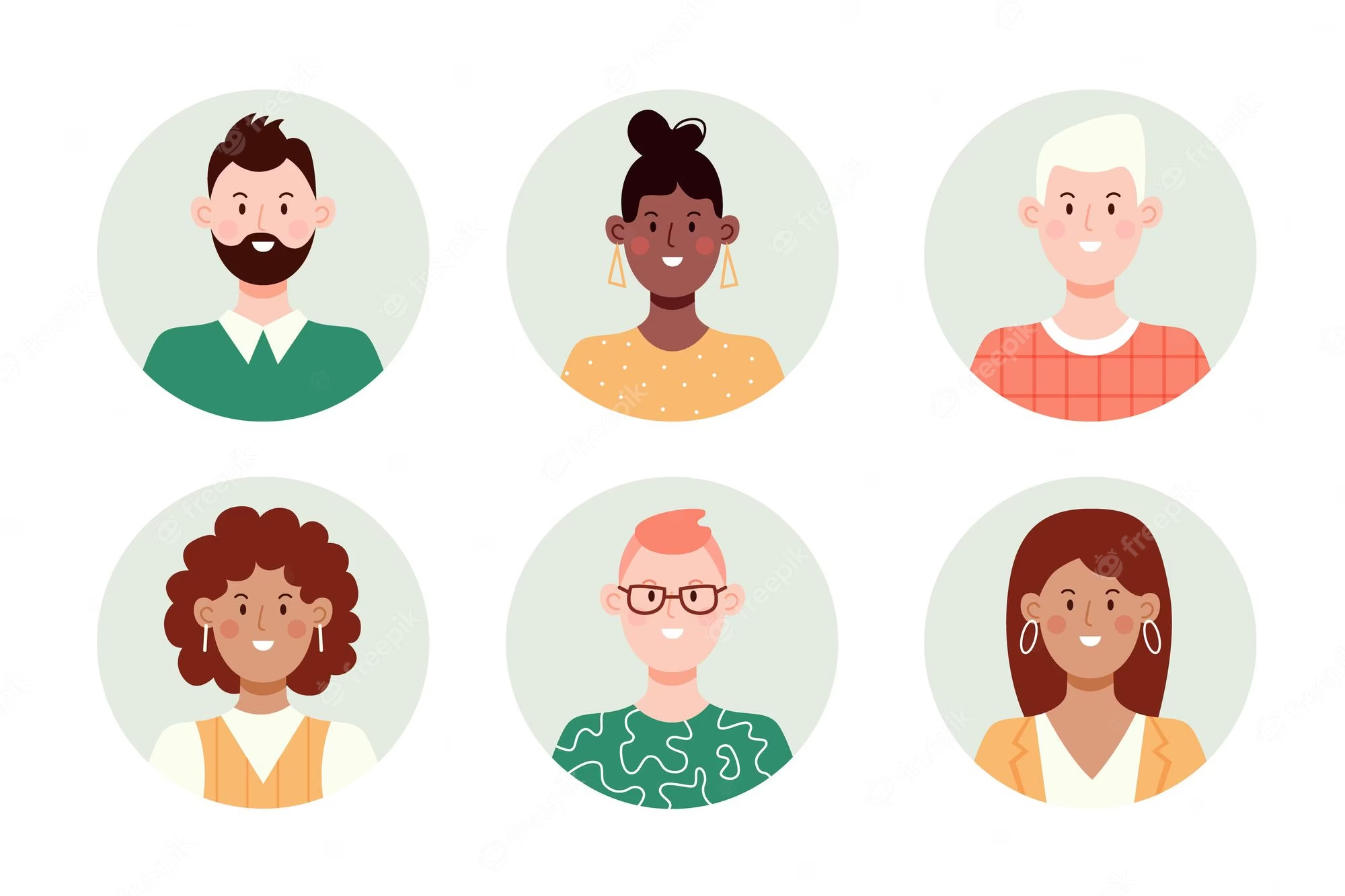
Traditionally, stock photos of real people would be used to visually describe a typical representative of a customer archetype. This has merit, in that it’s ultimately human, so when viewed can appear instantly relatable.
However, there is another view that this approach can be too specific, and formulate bias from the viewer immediately. A way round this is to use illustrations that can be graphically tailored to represent the common traits of the audience type more specifically, whilst not focusing on facial or physical aspects of the model used.
User (or Customer) Journey Maps
Personas, in isolation, have only limited use in helping teams to bring the right solution to life, in response to user research. A very useful natural extension of profiling your primary audience, as stated above, is to map out their journeys end-to-end, to bring those key insights into a more usable and actionable state.
Ideally with the Persona profile sitting to one side of the canvas, helping to set context around who they are, the map aims to chart the stages of the journey they go through in identifying a problem and seeking a solution.
Again, a common mistake is that businesses consider mapping to be more of a task flow through a product interaction, narrowing the view to the sequence of decisions made during a digital product or service interaction.

The ideal anatomy of a user journey map should be based on the following swim lanes:
Stage: Describe each stage of the journey with an associated sub-goal and estimated timespan.
Doing: This is the action that the user wants to, or is taking, at each stage.
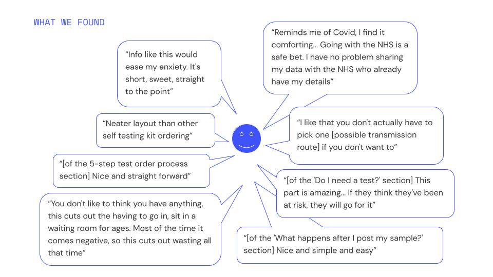
Thinking: These are the decision making processes that influence the action - it’s great if you can include example verbatim (anonymised) quotes from research to really make this hard evidenced.
Feeling: Akin to the emotional seismograph of the map, represented as a line that rises and falls accordingly, or use emojis to describe the associated feelings along the way.
Pain points: Highlighting where the journey may come unstuck.
Opportunities: Ideas on how each stage of the journey can be designed as a streamlined and user-centred process in the best way possible, navigating the pain points that stand in the way.
Ownership and support: The final lane aims to assign a business owner to each stage, to emphasise accountability and transparency, with a record of what resources that team will need to design a solution in response.
Once a set of user journey maps have been created, ideally in a multidisciplinary, co-designed approach, these set a strong foundation for design prototyping and deeper service blueprinting to align multiple (often siloed) business units, and in many situations, third party suppliers also.
Reporting and presenting back
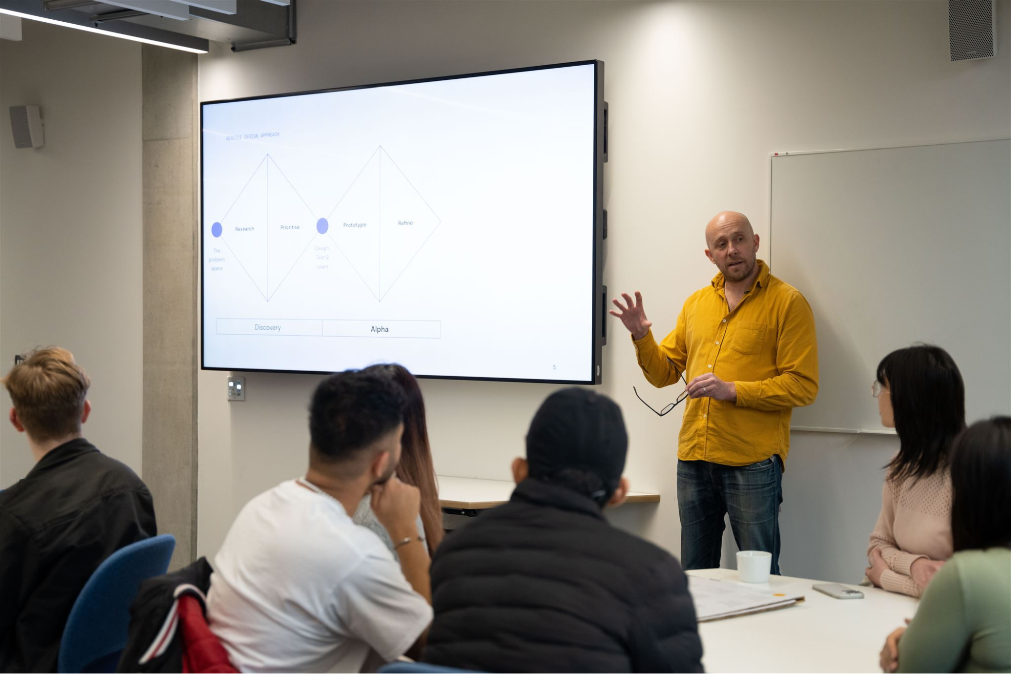
Armed with these valuable research outputs, any design team will be better placed to tell a compelling story when they play back their research work to their stakeholders. This promotes visual data sharing over turgid powerpoint decks.
In presentations, it’s also great to show the process of engaging users in interviews and workshops (where consent allows) and to bring quotes to life with headline stats.
Emphasise user need, and make recommendations as actionable as possible: painting a picture of what the next phase in the design process will look like and how ongoing design and development budgets will be risk managed, by continued testing with representative users along the way.
We're here to help
If you’re interested in finding out about our specific discovery and service design services, then you can find out more here.
Or check out our Introduction to service design and read our case study on how we helped NHS England and Preventx to engage with key user groups.
Or if you have any questions then please get in touch and ask us anything at hello@nuom.co.uk.